The Product
Earthly Vegan restaurant, located in Upstate NY, is a community-based establishment focused on making healthy plant-based food accessible to all. Vegan Eats targets customers who are vegan, non-vegan, health-conscious, and customers/workers who lack the time to cook. They offer a wide variety of vegan dishes for all to enjoy.
Background
I was inspired to recreate a local restaurants menu app to increase customer engagement, profitability and recognition. I am redesigning the app to improve the user experience - making the app easier and more enjoyable to use.
Project Duration
October 2024 - February 2025

My Role
UX Designer designing an app for Vegan Eats from conception to delivery.
Responsibilities
Conducting interviews, paper and digital wireframing, low and high-fidelity prototyping, conducting usability studies, accounting for accessibility, and iterating on designs.
User Research: Summary
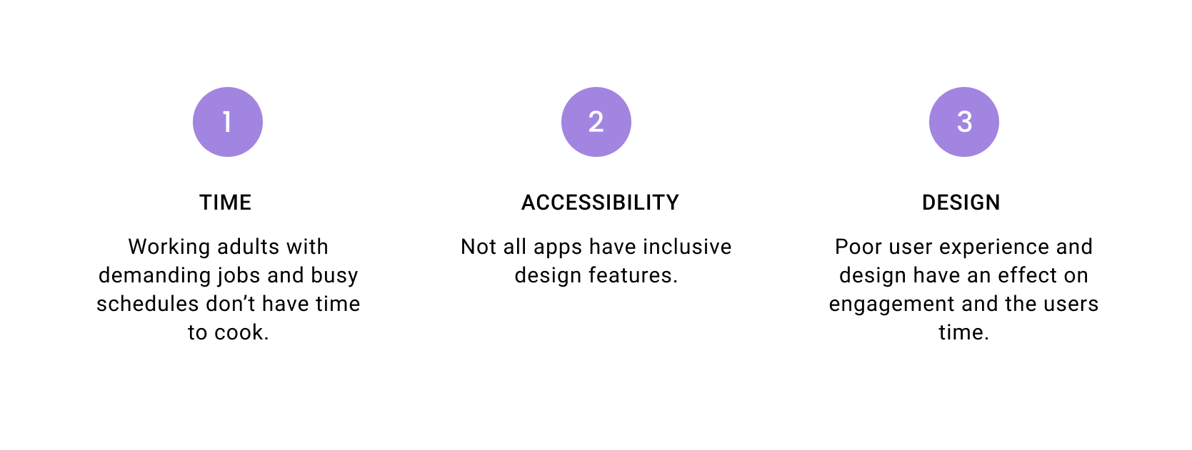
After completing user interviews and creating empathy maps, research shows that most users want to customize their meal options to their nutritional preferences and are busy working adults with demanding jobs and/or schedules who don’t have time to cook. Users also want apps that are easy to use and have an easy ordering process. Other user challenges include visual impairment and language barriers. Having an app that has an inclusive design improves usability and makes it more convenient and easier to use.
User Research: Pain Points
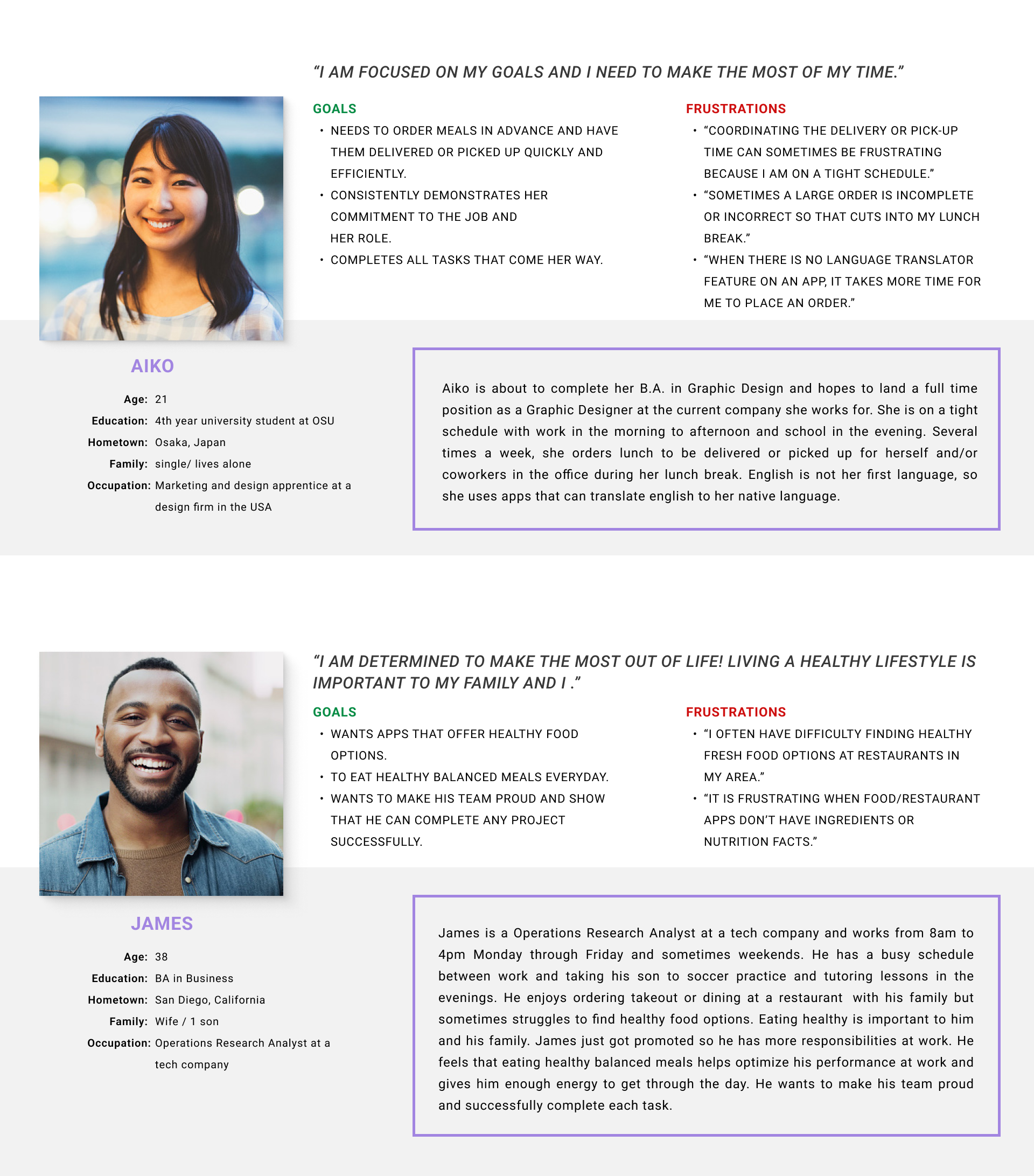
Personas
Competitive Audit Report
After researching direct and indirect competitor’s I found that most restaurant/food apps need work on brand identity, and lack inclusivity in their design.
Opportunities Identified Include:
- Make design inclusive: Users with disabilities say that it is frustrating that many apps are not accessible.
- Make design inclusive: Users with disabilities say that it is frustrating that many apps are not accessible.
- Customer service live chat feature (for convenience)
- Customize order
Earthly Vegan Original App Design

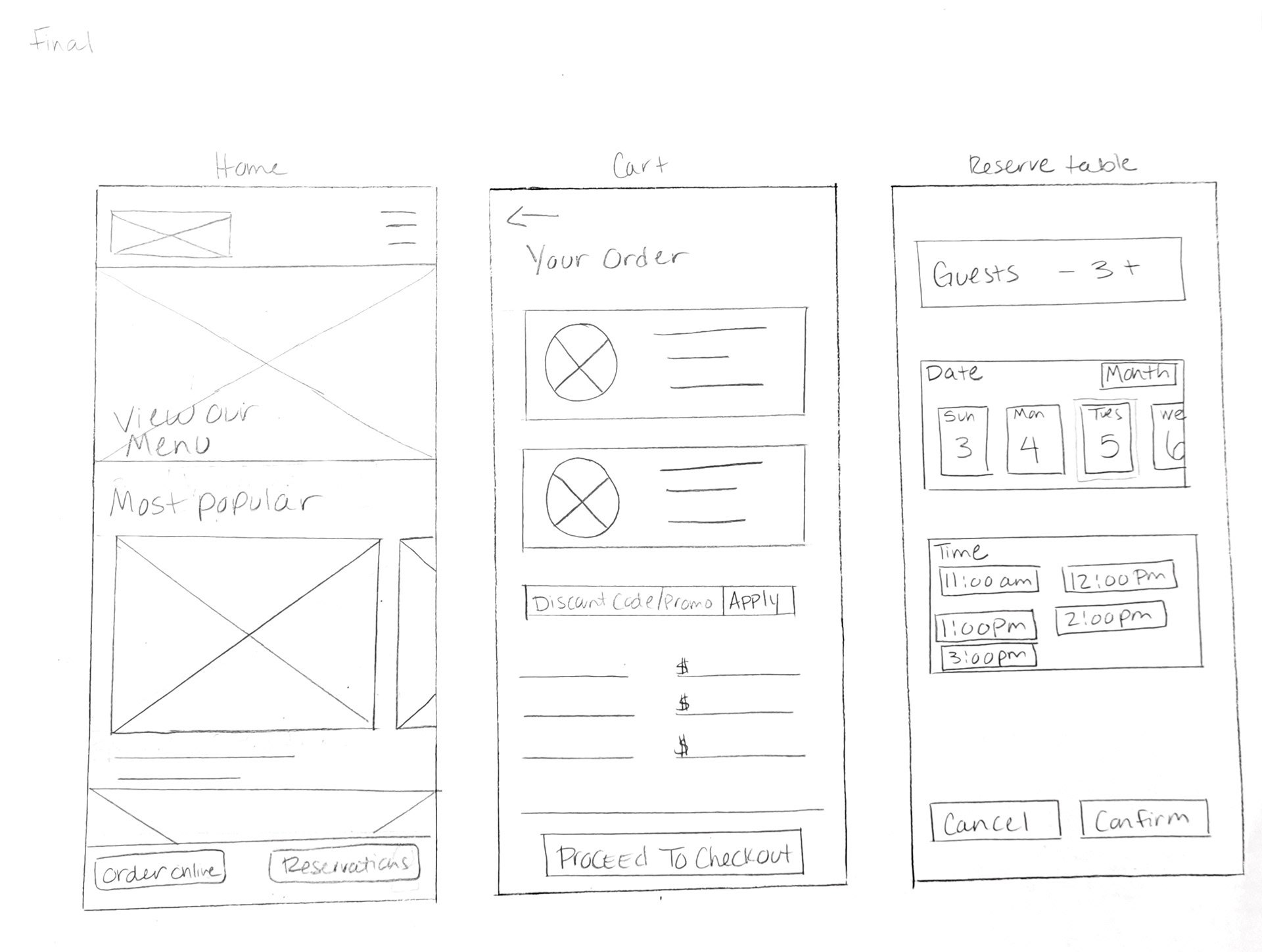
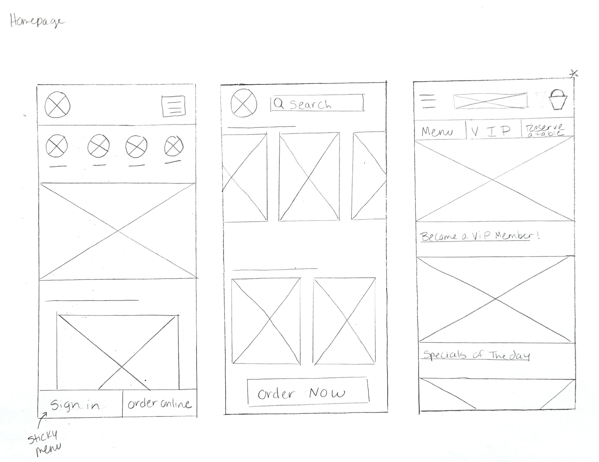
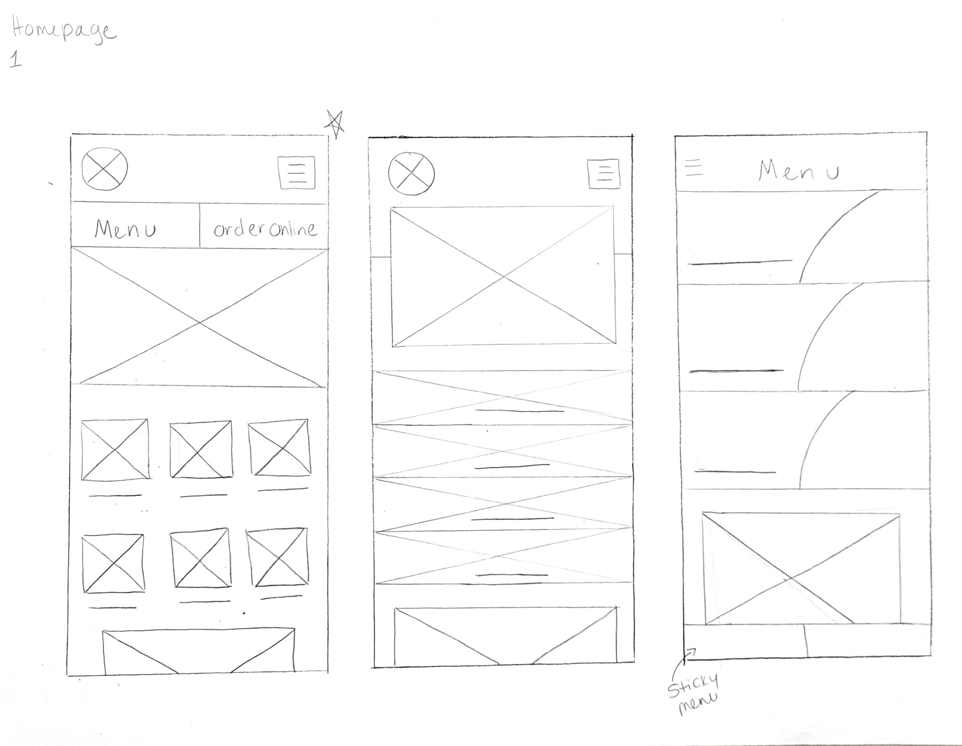
Paper Wireframes
Various iterations were drawn of each screen to easily identify mistakes and to brainstorm on how to address user pain points before creating digital wireframes.
Information Architecture

Digital Wireframes
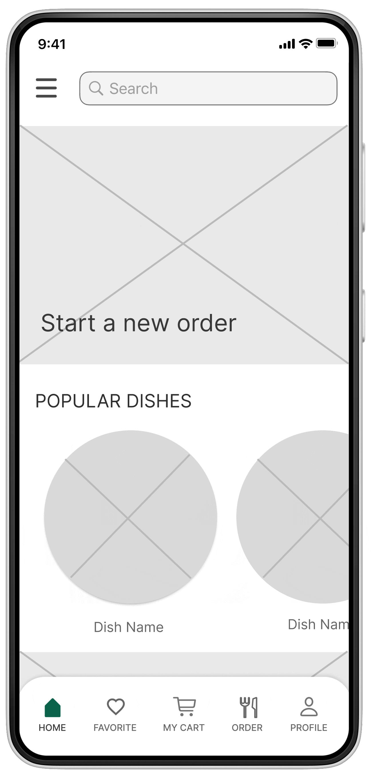
After the first usability study I revised the design with smaller elements and photos, so information is not so spread out. I also changed the location of the hamburger menu to the left of the screen so that the account/profile icon (right of screen) can be easily found.
The second iteration is more organized and visually appealing, making it easier to use and communicating information more effectively.
Digital Wireframes: 1st Round
- Elements/photos are too big and spread out.
- Although this design seems simpler, I thought about the visual design and layout and how I might improve it based on the usability study notes.
1st Round Usability Study Prompts
Prompt 1: Open the app and select a meal from the menu
Prompt 2: Add the meal to the cart
Prompt 3: proceed to go through the checkout and payment process
Prompt 4: Figure out where your profile would be located
Prompt 5: Would you use this app again?
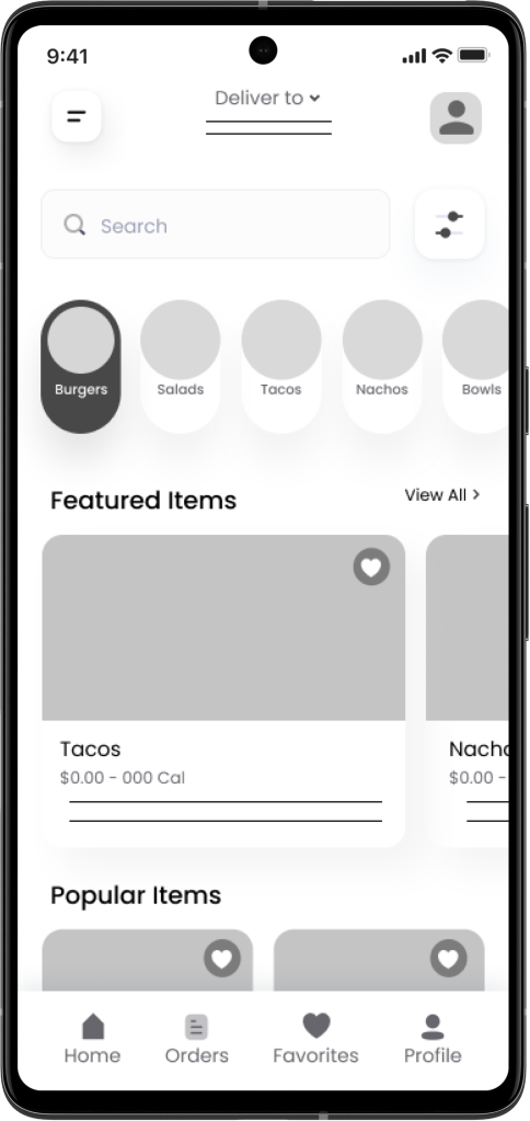
Digital Wireframes: 2nd Round
After the 1st digital wireframes and thinking through the preliminary flow, I reviewed what was necessary, unnecessary , and what areas needed improvement.
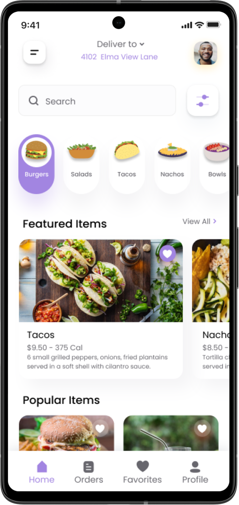
- I added dish categories to the home page so that users can see them right away and reduce the number of pages they need to click through to get to the food category.
- Easy access to each page and categories of the app by adding alternative options. This also helps make the ordering process easy.
- Adding words with buttons to add inclusivity for users with disabilities.
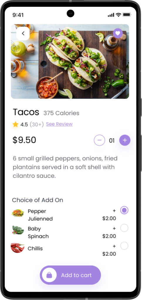
- Users can easily add items to their order.
- All information about the item is on one page.

2nd and 3rd Round Usability Study Prompts
Prompt 1: Open the app and select a meal
Prompt 2: Add the meal to the cart
Prompt 3: proceed to go through the checkout and payment process
Prompt 4: Go to your profile account to view favorites
Prompt 5: Now find the Contact Us page to view the live chat feature
Prompt 6: Would you use this app again?
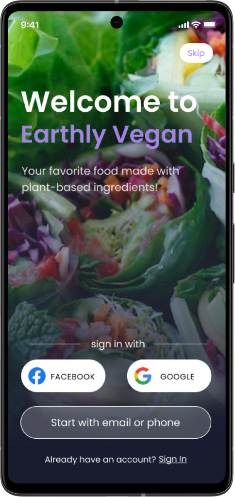
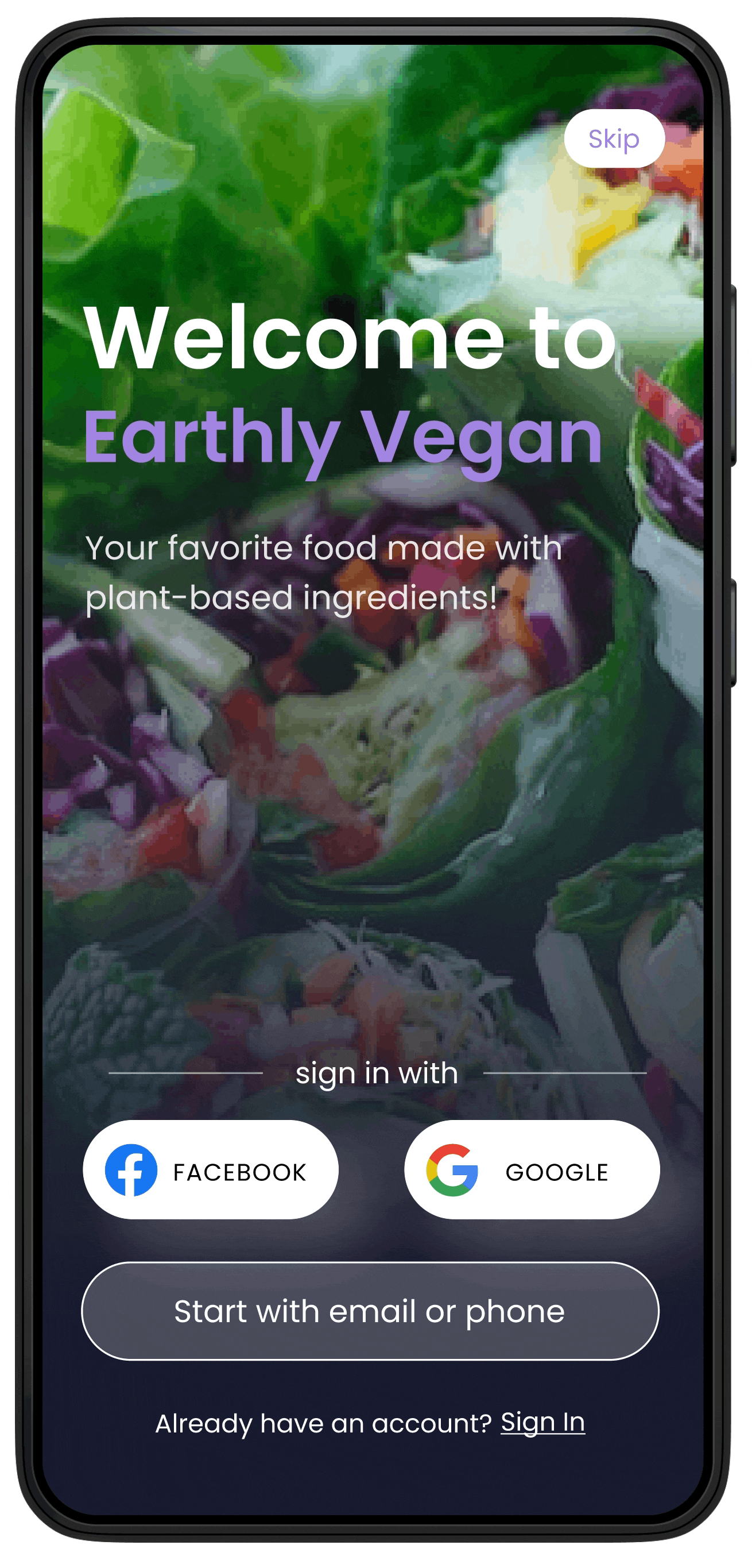
High-Fidelity Prototype
The final high-fidelity prototype completes the user flow with an added launch page, categories and a more visually appealing and intuitive design to help users find information faster and increase user engagement.
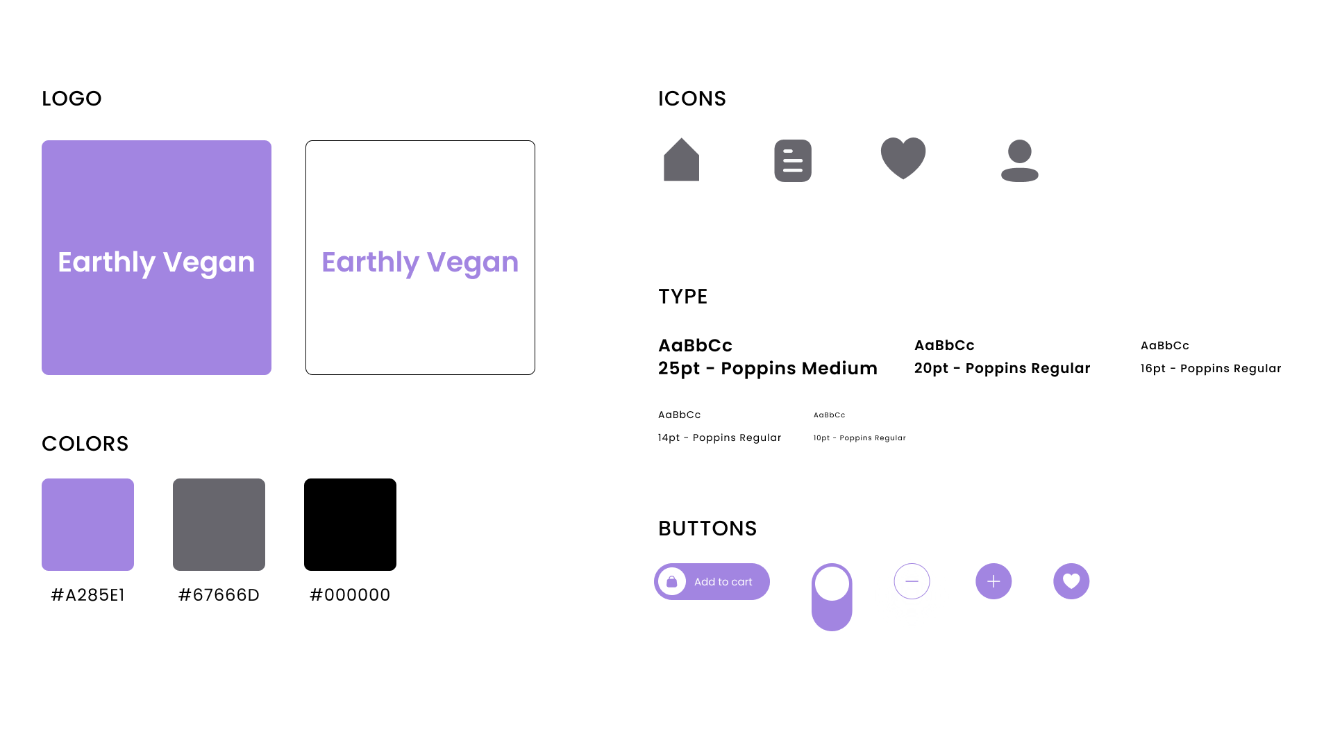
Style Guide
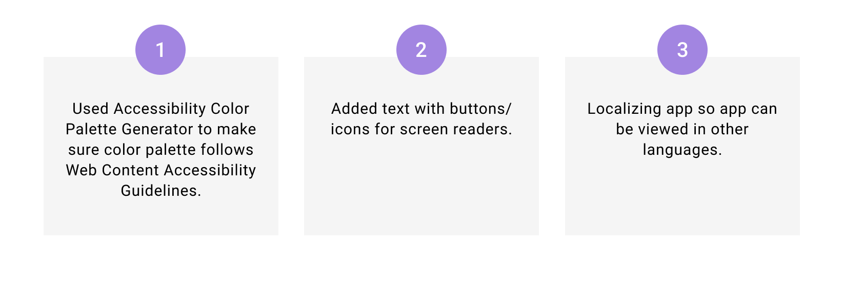
Accessibility Considerations
Next Steps
Conduct usability studies to continue to improve app and any new pain points or issues.